Manual
Version 5.1.7359_Beta3
2011-2025 RealObjects
Nimbudocs Editor is a registered trademark of RealObjects GmbH.
Nimbudocs Editor is a registered trademark of RealObjects GmbH.
Nimbudocs Editor can easily be integrated into a Web page using JavaScript. There are two basic steps to perform when integrating Nimbudocs Editor:
Nimbudocs Editor comes with a comprehensive JavaScript API designed to allow you to configure and integrate the editor into a web site. In the first step, we will demonstrate how to simply load the editor within a web page without any regards to the loading of content or more advanced integration requirements.
The JavaScript API for Nimbudocs Editor basically allows you to create a JavaScript object containing the editor. You can manipulate the editor's configuration by adding and modifying the objects' properties before it is finally loaded.
To use the JavaScript API, you should import the following library into to the page that will use Nimbudocs Editor.
The placeholder myserver has to be replaced by the URL of the server which runs Nimbudocs Editor.
The following JavaScript library has to be imported in your web site.
<script src="http://myserver/nimbudocseditor.js" type="text/javascript"></script>This is the simplest way to integrate Nimbudocs Editor into your web page.
window.onload = () => {
    NimbudocsEditor.create("nimbuContainer", "http://myserver");
};If you are not certain whether Nimbudocs Editor is supported by the browser or not, there are two possibilities to define the behavior if the editor is not supported.
Using the return value of the create method, which is false if the editor is not supported:
window.onload = () => {
    const isSupported = NimbudocsEditor.create("nimbuContainer", "http://myserver");
    if (!isSupported) {
        alert("This browser does not meet the requirements of Nimbudocs Editor.");
    }
};
Or defining the onnotsupported handler:
window.onload = () => {
    options = {
        onnotsupported: () => {
            alert("This browser does not meet the requirements of Nimbudocs Editor.");
        }
    }
    NimbudocsEditor.create("nimbuContainer", "http://myserver", options);
};The previous examples all required your web site to have a container element with the ID "nimbuContainer" which will contain the Nimbudocs Editor instance. It is also possible to dynamically inject this container into the web site when the editor is created.
window.onload = () => {
    const container = document.createElement("div");
    document.body.appendChild(container);
    NimbudocsEditor.create(container, "http://myserver");
};To get access to the Nimbudocs Editor API, you need the editor object. As the editor loads several resources asynchronously, it is not possible to get the editor object from the create-method. Instead you have to get it via the onready event handler.
The onready event is trigger once the editor is fully loaded and ready to use.
window.onload = () => {
    let nimbudocsEditor;
    const options = {
        onready: (editor) => {
            nimbudocsEditor = editor;
        }
    };

    NimbudocsEditor.create("nimbuContainer", "http://myserver", options);
};
Note that the API Object can only be used after, the onready event has been triggered.
There are several ways to load content into the editor. Basically, you can fetch the content either from a URL or you can directly load it as a string.
window.onload = () => {
    const options = { documentUrl: "documents/myDocument.html" };

    NimbudocsEditor.create("nimbuContainer", "http://myserver", options);
};
Remember that the document URL must be accessible by the server.
window.onload = () => {
    const options = {
        onready: (editor) => {
            editor.loadDocumentFromUrl("documents/myDocument.html")
        }
    };
    NimbudocsEditor.create("nimbuContainer", "http://myserver", options);
};After editing, you of course want to save it somehow. For this, you may use the respective API method to retrieve the document from the editor as a string. That string can now be saved e.g. to a database, depending on your integration.
const doc = await editor.fetchDocument();
doSomething(doc);One of the main features of Nimbudocs Editor is the collaboration mode. If you want other people to join your collaboration session, you need to make a web page available to them where they may join.
First, create a new web page. This page has to be accessible from anywhere you want other people to join from.
The content of a collab page is basically the same as a normal editor page with additional content. You may want to add the possibility for users to enter their user name or even a collaboration password.
In this example, we have a collab page "collab.html" and also have an HTML input form field with the ID "userName" where users can enter their user name. Also, the editor is not created when the page is loaded but when the "joinButton" is clicked.
document.getElementById("joinButton").addEventListener("click", function() {
    const userName = document.getElementById("userName").value;
    const options = { userName: userName };

    NimbudocsEditor.create("nimbuContainer", "http://myserver", options);
});
When you have set up your collab page, you have to specify it in your normal Nimbudocs Editor integration. This is done in the constructor by adding a link to the page.
window.onload = () => {
    const options = { collabUrl: "http://url-to-collab-page/collab.html" };

    NimbudocsEditor.create("nimbuContainer", "http://myserver", options);
};
Now when you start a collab session, the editor can create a link for guest users that directly redirects them to the collab page so that they may join your collab session.
Many of the API methods in Nimbudocs Editor are asynchronous. This means that these methods do not block the browser. In addition, these methods return a Promise object which is resolved at a later time once the asynchronous call to the Nimbudocs Editor server is finished.
Asynchronous methods are flagged with the ASYNC tag in the JavaScript API documentation. All methods flagged with
ASYNC return a Promise. Furthermore, all methods that start with fetch* return a Promise (like fetchDocument), but
please be aware that certain other methods may also return a Promise! Always refer to the API documentation to determine if a method returns a Promise.
For more information about Promises in general, please see refer to:
https://developer.mozilla.org/en/docs/Web/JavaScript/Reference/Global_Objects/Promise.
The following example show how an asynchronous method is used to retrieve the document content:
const doc = await editor.fetchDocument();
doSomething(doc);
The JavaScript API documentation includes a field labeled "Resolved With" for methods returning a Promise instead of a "Returns" field. Since these methods always return a Promise object, it is important to know with which value the Promise will be resolved.
When you need to wait for multiple Promises to be resolved, you can use the JavaScript Promise API or similar APIs like jQuery to execute a specified callback once all Promises have been resolved.
const p1 = editor.fetchNumberOfParagraphs();
const p2 = editor.fetchNumberOfWords();
const p3 = editor.fetchNumberOfCharacters();

// using Nimbudocs Editor (recommended)
NimbudocsEditor.when(p1, p2, p3).then((paras, words, chars) => {
    doSomething(paras, words, chars);
});

// using JavaScript Promise API
const [ paras, words, chars ] = await Promise.all([p1, p2, p3]);
doSomething(paras, words, chars);

// using jQuery
jQuery.when(p1, p2, p3).then((paras, words, chars) => {
    doSomething(paras, words, chars);
});
It is generally recommended to use the Nimbudocs Editor API for this purpose. This method returns a Thennable and is safe for other types of arguments,
including undefined. Arguments that are not Promises will be passed as-is to the then handler. If none of
the arguments are Promises, the then handler is called immediately.
Since the Promises returned by Nimbudocs Editor are thennable, the standard JavaScript Promise API can be used as well. However, be aware that the JavaScript Promises API is not supported by Internet Explorer versions below 11.
If a call to an asynchronous API method fails (e.g. due to network issues), you can wrap the code in a try-catch block
when using async/await patterns:
try {
    const numberOfParas = await editor.fetchNumberOfParagraphs();

    doSomethingOnSuccess(numberOfParas);
} catch (e) {
    doSomethingOnFail(e);
}The code samples in this manual assume that the browsers used to run Nimbudocs Editor support ECMAScript 2017. In legacy browsers that don't support
this standard, especially asynchronous programming with the await
keyword and async functions, you can use then, catch, and finally callbacks.
Most of the functionality of Nimbudocs Editor can be customized via the use of actions. These actions can be used as a part of the toolbar, context menu or menu bar such as is the case in the default user interface configuration file delivered with Nimbudocs Editor. Note however that this file does not contain all actions, and the number of available actions far exceeds the ones used in the editor's default configuration.
In addition to being used in the editor's user interface configuration, actions can also be invoked programmatically using JavaScript methods. Moreover, the integrator can define custom JavaScript actions and use those in the editor's user interface or invoke them programmatically if required.
There are some predefined shortcuts which can be used to invoke actions using your keyboard.
You can use the API method invokeAction in order to trigger actions programmatically. This method also accepts an optional parameter called
actionCommand.
editor.invokeAction("bold");
editor.invokeAction("align", "center");
To access then entire functionality provided by the action, use the API method getAction which returns an Action object.
Actions also support adding a listener using the addInvokeListener, which is notified when the action is invoked.
It is also possible to prevent the action from executing its default functionality. To do this,
you can call the preventDefault method on the event which is passed to the invocation
listeners.
The following examples shows how to modify and override the default functionality of the "bold" and "insert-date" actions.
editor.addEventListener("bold", "actioninvoke", function(e) {
    // add custom code
    const element = await editor.fetchCurrentElement();
    console.log("toggling bold state for element: " + element);
});
editor.addEventListener("insert-date", "actioninvoke", function(e) {
// custom code
const monthNames = [ "January", "February", "March",
"April", "May", "June",
"July", "August", "September",
"October", "November", "December" ];
const date = new Date();
const day = date.getDate();
const month = date.getMonth();
const year = date.getFullYear();
editor.insertContent(monthNames[month] + " " + day + ", " + year);
// override default functionality
e.preventDefault();
});An action has three possible states:
enabledState: The state that indicates whether the
action is currently enabled (Example: The "table-properties-dialog" action is
enabled if the caret is placed inside a table).selectedState: The state that indicates whether the
action is currently selected (Example: The "align-right" action is selected
when the caret is inside text that is right aligned).stringState: This state indicates the value of the
action as a string (Example: The "font-size" action can
have string states like "12pt", "36pt", etc.).You can set these states in client-side stateless actions, which is e.g. useful when you have radio-button-like action groups.
editor.addEventListener("my-action1", "actioninvoke", function(e) {
    this.selectedState = true;

    editor.getAction("my-action-2").selectedState = false;
    editor.getAction("my-action-3").selectedState = false;

    // custom code...
});

editor.addEventListener("my-action2", "actioninvoke", function(e) {
    this.selectedState = true;

    editor.getAction("my-action-1").selectedState = false;
    editor.getAction("my-action-3").selectedState = false;

    // custom code...
});

editor.addEventListener("my-action3", "actioninvoke", function(e) {
    this.selectedState = true;

    editor.getAction("my-action-1").selectedState = false;
    editor.getAction("my-action-2").selectedState = false;

    // custom code...
});
You can also add listeners to the action states which will be notified when the respective state changes.
var boldAction = editor.getAction("bold");

boldAction.addEventListener(Action.prototype.PROPERTY_SELECTED_STATE, function() {
    if (boldAction.selectedState === true) {
        console.log("this text is bold");
    } else if (boldAction.selectedState === false) {
        console.log("this text is not bold");
    }
});Nimbudocs Editor features very powerful APIs to configure the editor's user interface. This is
usually done via an external JSON file or a JavaScript object.
This article describes how the parts of the user interface, that are specific to certain elements
in the document, can be configured.
Nimbudocs Editor displays handles when selecting images, QR codes and media elements. With these handles, the
selected element can be moved, resized or manipulated in some way. Should you not want to allow all of these
options for a certain kind of element, you can disable parts or all of the handle functionality for any
element matching a CSS selector. Use the CSS property For example, if you want to disable cropping and free scaling for all images, you can use the following style sheet:Handles
-ro-nimbu-handles-disable to configure which handle elements should be disabled.
More information about the CSS property can be found
here.
Example
img {
    -ro-nimbu-handles-disable: crop freescale;
}
If not specified otherwise, Nimbudocs Editor loads a default action map, ui config, as well as a locale file. The action map is a JSON object containing all available actions to Nimbudocs Editor, the ui config defines content and structure of the user interface, and the locale contains a mapping between locale constants and localized text in different languages.
Usually it is recommended to only extend the action map and the locale instead of replacing them. In these extensions, new entries will be added to the default action map or locale files. Entries in the extensions have higher priority than the entries in the default files, thus default entries can be overridden.
The action map is a nested JSON object containing action IDs and several configuration options. Each action in the action map supports the following properties.
"stateless" instead of
"client", the action will not be created on the server and thus cannot
receive automatic action state updates. These actions can also not be restricted by the
allowedContextNames and prohibitedContextNames. The third type is
"server" and only used by internal Nimbudocs Editor actions.
| Type: | String |
| Argument: | <optional> |
| Default: | "client" |
| Type: | String |
| Argument: | n/a |
| Default: | n/a |
| Type: | String |
| Argument: | <optional> |
| Default: | n/a |
If set to null and none of the other *IconUrl properties is set, no icon will be displayed/loaded for this action.
| Type: | String |
| Argument: | <optional> |
| Default: | n/a |
| Type: | String |
| Argument: | <optional> |
| Default: | n/a |
| Type: | String | Boolean |
| Argument: | <optional> |
| Default: | n/a |
| Type: | String | Boolean |
| Argument: | <optional> |
| Default: | n/a |
| Type: | String | Boolean |
| Argument: | <optional> |
| Default: | n/a |
| Type: | String |
| Argument: | <optional> |
| Default: | n/a |
ctrl: The CTRL key.alt: The ALT key.shift: The shift key.cmd: The Mac CMD key.msck: The CTRL key on Windows and the CMD key on Mac environments."msck d"
| Type: | String | Boolean |
| Argument: | <optional> |
| Default: | n/a |
| Type: | String | Boolean |
| Argument: | <optional> |
| Default: | n/a |
"none", the action may not be used at all.
This setting is mutually exclusive with the prohibitedContextNames setting.
| Type: | Array |
| Argument: | <optional> |
| Default: | n/a |
| Type: | Array |
| Argument: | <optional> |
| Default: | n/a |
| Type: | String |
| Argument: | <optional> |
| Default: | "CARET_OR_SELECTION" |
The default action map may also be extended, which means that you do not have to write a completely new action map from scratch. This is also useful if you want to add contexts to existing actions
const actionMapExt = {
    "insert-image-dialog": {
        "title": "L_INSERT_IMAGE_DIALOG",
        "iconText": "L_INSERT_IMAGE_DIALOG_TEXT",
        "allowedContextNames": [
            "imagefield-context"
        ]
    },
    "bold": {
        "type": "server",
        "title": "L_BOLD",
        "shortcut": "msck B",
        "iconText": "L_BOLD_TEXT",
        "allowedContextNames": [
            "none"
        ]
    },
    "my-custom-action": {
        "type": "stateless",
        "title": "L_MY_CUSTOM_ACTION",
        "iconUrl": "icons/custom-action-icon.png"
    }
};
In the example above, the "insert-image-dialog" action is only allowed in the context "imagefield-context", the "bold" action is disabled and the custom action "my-custom-action" is added.
The following example shows how to write a locale extension. The locale extension is a nested JSON object containing language codes as keys and a mapping of locale constants and localized strings as value.
The language code "" (empty string) means that the mappings will be applied to
all languages, if not otherwise specified.
const localeExt = {
    "": {
        "L_CUSTOM_TAB": "Custom Tab",
        "L_PROPERTIES_PANE": "Properties"
    },
    "de-DE": {
        "L_PROPERTIES_PANE": "Eigenschaften"
    },
    "fr-FR": {
        "L_PROPERTIES_PANE": "Propriétés"
    }
};The structure of the user interface is defined in the UIConfig. This JSON document configures which actions should be represented with buttons and in which tab and which panel they should appear. Furthermore, the UIConfig also defines the content of the context menu.
If no UIConfig is specified or if it could not be parsed, a default configuration is used instead.
The UIConfig consists of a toolbar definition, a definition of the editor ribbons, as well as quick actions (available to the user independently of which tab was selected).
The ribbons in turn consist of one or more tabs, which can have one or more panes. Panes are divided into sub-panels, which include a list of actions and the configuration for these actions.
The UIConfig object is the root document object of JSON object representing the user interface. It defines the toolbar configuration as well as the context menu.
| Field Name | Type | Description |
| toolbar | Toolbar Object | Specifies the configuration for the editor toolbar. |
| contextmenu | Context Menu Object | Specifies the configuration for the editor context menu. |
The toolbar uses a ribbons layout and is divided into several different areas (as shown in the picture below):
smallPanel, largePanel, etc.) and represented by the same UI element (through buttons or drodown lists).
This configures which quick actions are available and holds the configuration for the Ribbons Object.
| Field Name | Type | Description |
| quickactions | array | An array with the IDs of the actions that should appear in the quick actions area. |
| ribbons | Ribbons Object | Configures the editor ribbons. |
"toolbar": {
    "quickactions": [
        "new-document"
    ],
    "ribbons": {
        "options": {
            "sortabletabs": "false"
        },
        "elements": {
            "L_EDIT_TAB": {
                "shortcut": "msck shift e",
                "L_DOCUMENT_PANE": {
                    "subpanels": [
                        {
                            "size": "mediumPanel",
                            "actions": [
                                "new-document"
                            ]
                        }
                    ]
                }
            }
        }
    }
}This configures the options for the editor ribbons as well as which tabs are available.
| Field Name | Type | Description |
| options | Ribbons Options Object | This is an object that configures options of the editor ribbons. |
| elements | [string, Tab Object] | This object contains a definition for all tabs, where the string key is used as the (localized) display name for the tab. IMPORTANT: The key |
"ribbons": {
    "options": {
        "sortabletabs": "false"
    },
    "elements": {
        "L_EDIT_TAB": {
            "shortcut": "msck shift e",
            "L_DOCUMENT_PANE": {
                "subpanels": [
                    {
                        "size": "mediumPanel",
                        "actions": [
                            "new-document"
                        ]
                    }
                ]
            }
        }
    }
}This is a an object that configures options for the all tabs, i.e. the ribbons as whole.
| Field Name | Type | Description |
| sortable | boolean | Specifies whether the tabs should be sortable. Default: false. |
"options": {
    "sortabletabs": "false"
}This object configures an individual tab.
| Field Name | Type | Description |
| shortcut | string | OPTIONAL. Specifies a keyboard shortcut that can be used to activate this tab. |
| Field Pattern | Type | Description |
| string | Pane Object | This is a map of all panes displayed on this tab, where the string key is used as the (localized) display name for the pane. IMPORTANT: The field pattern must have a unique name within the containing object. It also may not contain any spaces. |
"L_EDIT_TAB": {
    "shortcut": "msck shift e",
    "L_DOCUMENT_PANE": {
        "subpanels": [
            {
                "size": "mediumPanel",
                "actions": [
                    "new-document",
                    "load-url-dialog",
                    "page-properties-dialog",
                    "create-pdf-dialog",
                    "print-dialog",
                    "source-view-dialog"
                ]
            }
        ]
    }
}This object configures which subpanels are available in a particular pane.
| Field Name | Type | Description |
| subpanels | [Button Panel Object | Dropdown Panel Object] | An array of Button Panel Objects and/or Dropdown Panel Objects. Each Button Panel Object or Dropdown Panel Object holds configuration options for this panel, as well as a list of actions available through this panel. |
"L_DOCUMENT_PANE": {
    "subpanels": [
        {
            "size": "mediumPanel",
            "actions": [
                "new-document",
                "load-url-dialog",
                "page-properties-dialog",
                "create-pdf-dialog",
                "print-dialog",
                "source-view-dialog"
            ]
        }
    ]
}This object configures the options for this button panel, as well as the list of actions available through this panel.
| Field Name | Type | Description |
| size | "tinyPanel" | "smallPanel" | "mediumPanel" | "largePanel" | Specifies the size of the buttons of this subpanel. For possible values see the column "type". |
| displaytext | boolean | Whether the button should have a label. Default: false. |
| actions | array | An array with the IDs of the actions that should appear in this panel area. |
{
    "size": "mediumPanel",
    "actions": [
        "new-document",
        "load-url-dialog",
        "page-properties-dialog",
        "create-pdf-dialog",
        "print-dialog",
        "source-view-dialog"
    ]
}This object describes the requirements that must be fulfilled to created a dropdown panel.
| Field Name | Type | Description |
| size | "dropdownpanel" | The value for size must be dropdownpanel to configure a Dropdown Panel. |
| comboactions | [string, Combo Actions Object] | A map where the identifier must correspond to an action ID. The Combo Actions Object configures options for the dropdown as well as actions available through the dropdown. The action correspdonding to this identifier will be invoked when content is manually entered in the dropdown. The content entered in the dropdpown will be used as the action's its actionCommand when invoking the action represented by this identifier (see Handling Actions). |
{
    "size": "dropdownPanel",
    "comboactions": {
        "font-size": {
            "options": {
                "comboWidth": "150",
                "dropdownWidth": "150"
            },
            "dropdownactions": {
                "font-size-default": "",
                "font-size-8": "",
                "font-size-9": "",
                "font-size-10": "",
                "font-size-11": "",
                "font-size-12": "",
                "font-size-14": "",
                "font-size-16": ""
            }
        }
    }
}This object configures the options for this dropdown panel, as well as the list of actions available through this panel.
| Field Name | Type | Description |
| options | Dropdown Panel Options Object | An object holding options for this dropdown panel. |
| dropdownactions | Map[string, string] |
For each entry in this map, the editor will try to find an action with an ID that equals the entry key. Different behavior applies depending on whether or not such an action was was found. If such an action ID was found, a dropdown item corresponding to this action is added to the dropdown menu. Interacting with this dropdown item will invoke the corresponding action. Note that in this case the value of this entry is ignored. If no action with an ID equal to this key was found, the key will be used as the This is useful in order to populate the dropdown list with entries that invoke an action with a predetermined |
"font-size": {
    "options": {
        "comboWidth": "150",
        "dropdownWidth": "150"
    },
    "dropdownactions": {
        "font-size-default": "",
        "font-size-8": "",
        "font-size-9": "",
        "font-size-10": "",
        "font-size-11": "",
        "font-size-12": "",
        "font-size-14": "",
        "font-size-16": ""
    }
}This object configures options for this particular dropdown panel.
| Field Name | Type | Description |
| comboWidth | string | The width of the dropdown box in pixels when closed. |
| dropdownWidth | string | The width of the dropdown box in pixels when opened. |
"options": {
    "comboWidth": "150",
    "dropdownWidth": "150"
}See chapter Defining the Context Menu for details
{
    "toolbar": {
        "quickactions": [
            "undo",
            "redo"
        ],
        "ribbons": {
            "options": {
                "sortabletabs": "false"
            },
            "elements": {
                "L_EDIT_TAB": {
                    "shortcut": "msck e",
                    "L_DOCUMENT_PANE": {
                        "subpanels": [
                            {
                                "size": "mediumPanel",
                                "actions": [
                                    "new-document",
                                    "load-url-dialog"
                                ]
                            }
                        ]
                    },
                    "L_FONT_PANE": {
                        "subpanels": [
                            {
                                "size": "dropdownPanel",
                                "comboactions": {
                                    "font-size": {
                                        "options": {
                                            "comboWidth": "150",
                                            "dropdownWidth": "150"
                                        },
                                        "dropdownactions": {
                                            "font-size-default": "",
                                            "font-size-8": "",
                                            "font-size-12": "",
                                            "font-size-18": "",
                                            "font-size-24": ""
                                        }
                                    }
                                }
                            }
                        ]
                    }
                }
            }
        }
    }
}
In the example above, the toolbar has one tab, with two panes. Their names are locale codes that will translated into the editor's language. The second pane has a simple dropdown menu with a specified width of 150 pixels.
All entries that may appear in the context menu are defined in the UIConfig using the key "contextmenu" with an array as the value.
This array represents the main level of the context menu and can be filled with more array, action-names and submenu objects.
| Name | Type | Allowed Children / Properties | Description |
| Root Menu | Array | Groups | The main level of the context menu. This scheme is also used for the submenu items array. |
| Group | Array | Actions, Submenus | A horizontal line separates the groups from each other. |
| Action | String | N/A | This is the id of the action this menu item is based on. Label and icon are also retrieved from this action. |
| Submenu | Object |
|
The submenu item opens another menu level when hovering over it. |
{
    "toolbar": {
        // ...
    },
    "contextmenu": [
        [
            {
                "name": "L_ALIGN",
                "menuid": "alignmenu",
                "items": [
                    "align-left",
                    "align-center",
                    "align-right",
                    "align-justify"
                ]
            },
            {
                "name": "L_CONTEXT_STYLE",
                "menuid": "stylemenu",
                "items": [
                    [
                        "bold",
                        "italic",
                        "underline",
                        "strikethrough"
                    ],
                    [
                        "script-super",
                        "script-sub"
                    ]
                ]
            }
        ],
        [
            "image-properties-dialog"
        ]
    ]
}
The sample above is the UIConfig for a context menu with two levels. The first group has two submenu items (text-align and style menus), each of them has several actions. The second group has only one action (image-properties-dialog).
Please Note: Nimbudocs Editor disables actions that can not be used at the current caret position or context as it is called. Their context is defined in the action map.
As long as at least one item in a group is active, the inactive one are just disabled. If all items in a group are disabled, no item is shown and the whole group is left out of the context menu.
In general, the context menu should offer actions for words that have been recognized as misspelled. Whether the following actions will appear depends on whether the spellchecker or respectively the grammar checker have been enabled and the current text has been marked as a mistake:
| Action | Description |
| spellcheck-add-word | Adds this word to the personal dictionary. |
| spellcheck-ignore-all | Ignores this word and all further occurrences of it. |
| spellcheck-suggestions | This is a special action replaces the current word with a suggestion made by the spellchecker. Depending on how many suggestions for the misspelled word are available, there are generated several entries in this action's group. |
| grammar-suggestions | This is a special action replaces the text currently marked by the grammar checker with one suggestion of its suggestions. In some cases there are multiple suggestions, in which case several entries are generated in this action's group. |
Note: It is possible to limit the number of the suggestions that are shown in the context menu. To do so, just add -n to spellcheck-suggestions, or grammar-suggestions where n is the desired limit. For example spellcheck-suggestions-3 would show the best three suggestions.
Spell checker dictionaries contain a list of words that are recognized as spelled correctly for a certain language. The following types of dictionaries are supported:
Nimbudocs provides a personal dictionary that allows individual users to customize spell checking. It is automatically available without further integration code. Please note: The personal dictionary is stored inside HTML 5 local storage. All limitations regarding local storage apply. It is possible to provide Nimbudocs with an application dictionary. The following example adds "Realobjects" and "Nimbudocs" to the american english dictionary: Setting an application dictionary should be done early the onready event handler. This way the dictionary is available from the start.Personal Dictionary
Application Dictionary
var applicationDictionary = {
    "en-US" : ["RealObjects", "Nimbudocs"]
};
editor.spellChecker.setDictionary(applicationDictionary, "application");
Nimbudocs Editor features a rich event handling API which can be used to execute custom code after one of the various supported events has been fired.
Event handlers are registered by using the API method
addEventListener. The first parameter specifies
the target to which the handler is registered and the second parameter defines the event type. A custom event handler
can then be passed as the third parameter.
Document events are fired when the user interacts with HTML elements in the document in certain ways. The supported events mimic the functionality of JavaScript and jQuery mouse events.
Please note that some events like "mouseover" may be fired very frequently. Therefore adding an excess amount of listeners to these events or executing complex code during these events may negatively impact performance.
editor.addEventListener("p", "mousedown", function(e) {
    console.log("This is a paragraph");
});// add a tooltip container to the web page
jQuery("body").append("<div id='tooltip'></div>");
/**
* Set the text content of the tooltip from the 'alt' attribute of the element, as well as the position
* of the tooltip, relative to the element and make the tooltip visible.
*/
editor.addEventListener("img[alt]", "mouseenter", function(e) {
jQuery("#tooltip")
.text(e.target.attributes.alt)
.css({ left: e.target.offsetLeft + e.target.width, top: e.target.offsetTop })
.show();
});
// Hide the tooltip
editor.addEventListener("img[alt]", "mouseleave", function(e) {
jQuery("#tooltip").hide();
});There is only one supported event which is fired when an action is invoked.
editor.addEventListener("bold", "actioninvoke", function(e) {
    console.log("boldifying...");
});The only supported event dictionaryChange is fired when one of the dictionaries was changed, e.g. when a new word was added.
editor.addEventListener("document", "dictionaryChange", function(e) {
    let newDictionary = e.dictionary;
    let promise;

    if (newDictionary === undefined) {
        promise = editor.spellChecker.fetchDictionary(e.persistanceLevel).then((dictionary) => {
            newDictionary = e.dictionary;
        });
    }

    await NimbudocsEditor.when(promise);
    console.log(newDictionary);
});An event object is passed to each listener which contains useful information about the event. This object is an instance of
Event. Some of its properties are present for all event types, e.g.
type which contains the event type. Other properties are exclusive to specific event types or have
different data types depending on the event type.
Please see the API documentation for more information about the properties and methods.
All edit operations in Nimbudocs Editor are enabled for all elements of the document by default. But there are situations where it is necessary to disable a specific number of operations (mostly all) for specific elements of the document. In Nimbudocs Editor this functionality is called "restricted editing" and can be controlled via CSS.
Nimbudocs Editor provides two properties to mark ranges of a document as "editable" or "not editable". The properties are
-ro-editable and -ro-editable-inside. The difference between both properties is which area of the DOM
is affected by the specified editability state. As both properties are inheritable properties, this state will also be
inherited.
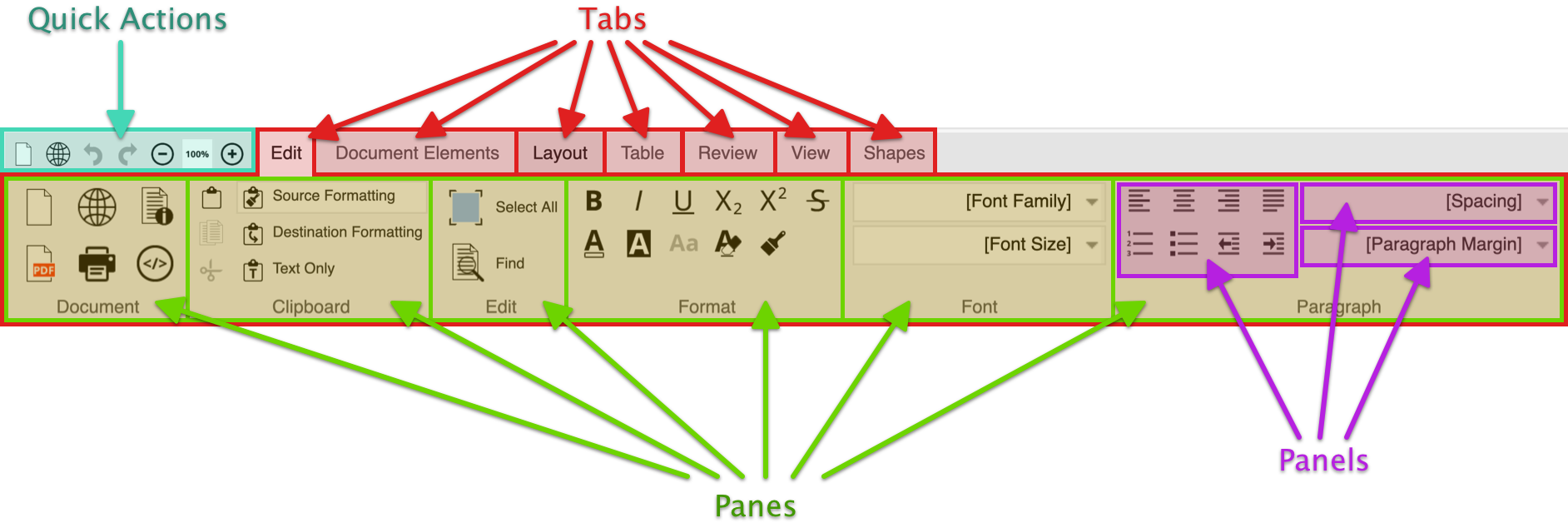
In the following diagram the orange node has set -ro-editable to false. As a result, all areas
highlighted with red circles are marked as "read-only".
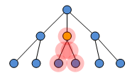
In the following example the orange node has set -ro-editable-inside to false. All
areas highlighted with red circles are marked as "read-only".
The difference between the two examples is that in the second one all areas except the node itself are marked as "read-only".
Using these two properties it is possible to arbitrarily nest areas with differing editability states within
each other. For example it is possible to create a read-only table, inside an editable div,
inside a read-only ol ,inside an editable div and so on.<
-ro-editable |
|
| Value: | true | false | no-deletion |
| Initial: | true |
| Applies to: | all elements |
| Inherited: | yes |
| Percentages: | N/A |
| Media: | all |
| Computed value: | as specified |
This property defines whether an element and all its descendants are editable, not editable (read-only) or can be edited, but not deleted.
How this property is evaluated depends on the operation. If an operation is not a deletion operation then, no-deletion is
equivalent to true. If an operation is a deletion operation, then no-deletion is equivalent to
false.
-ro-editable-inside |
|
| Value: | true | false | no-deletion |
| Initial: | true |
| Applies to: | all elements |
| Inherited: | yes |
| Percentages: | N/A |
| Media: | all |
| Computed value: | as specified |
This property describes whether all descendants of an element are editable, not editable (read-only) or can be edited, but not deleted.
How this property is evaluated depends on the operation. If an operation is not a deletion operation, then no-deletion is
equivalent to true. If an operation is a deletion operation, then no-deletion is equivalent to
false.
If an element is either not editable or not deletable then all ancestors of this element are automatically not deletable. This descendant dependency is necessary in order to ensure that an undeletable element can not be deleted by deleting an editable ancestor.
If an element is not deletable then it must be ensured on the application side that all style sources (e.g. classes or attributes) which enforce that this element is undeletable are removed from clones of that element. Otherwise it would be possible to insert elements into the document which can not be deleted anymore. In other words, undeletable elements should only be inserted and removed by the application, not by users.
The JavaScript API method setIgnoreReadOnly can be used to specify whether the following JavaScript
API calls should respect or ignore the CSS properties -ro-editable and -ro-editable-inside.
If this flag is set to true, then JavaScript API calls will always be performed even if they affect elements
that are marked as read-only. The default value is false. This functionality can be used for example to
allow an application to perform special document mutations for elements which are "read-only" from the
user's point of view.
Each edit operation evaluates the editability state in a particular granularity. Some operations are finely grained while others are coarsely grained. Each operation supports at least the document root as the finest granularity. The following table shows for all operations the corresponding granularity.
| Operation | Granularity |
| Inline operations | Paragraph |
| Paragraph operations | Paragraph |
| Container operations | Container |
| List operations | Top level list |
| Table operations | Table |
| All other operations | Document root |
Style Templates are formatting operations created from CSS and transformed into editor actions. This allows integrators and end-users alike to apply a vast amount of CSS styles to different elements of their document.
The chapter Overview provides an introduction to the Style Templates system and how it works in principle.
To learn how to define Style Templates via CSS see the Chapter Style Template CSS. It contains information about necessary properties and existing limitations.
A Style Template is a CSS style rule that is interpreted by Nimbudocs Editor as a formatting operation for single DOM elements. Applying a Style Template means changing the element in a way that makes it fit the Style Template selector.
The selector defines to which elements the style rule applies. For Style Templates, it also describes how the formatting of the element will be modified in order to fit the selector. Nimbudocs Editor interprets the selector by splitting it up and sorting the selector parts into one of two categories: Requirements and Transformation Steps.
Requirements are those parts of the selector that need to exist on an element in order for the Style Template to be applied to it. Transformation Steps are changes that need to be done in order for the element to fit the selector. Which parts of the selector are considered requirements and which parts are not depends on the element type of Style Template defined inside the style declaration. More information on this topic is given in the chapter Style Template CSS - The Selector.
The style declaration mainly defines what an element will look like that matches the style rule's selector. In case of Style Templates this means the style declaration defines the look of the Style Template.
Besides the visual properties the style declaration also needs to contain at least one special property (-ro-style-template) to tag the style rule as Style Template. This property also defines the element type of the Style Template and thus the basic formatting behavior. For more information which properties there are to create and configure Style Templates and how they work see the chapter Style Template CSS - Properties.
The Style Template definition made with CSS is automatically translated into Java actions. Throughout this translation, information from the Style Template properties is used to define how these actions are composed. The most important information during translation is the element type the Style Template should handle.
Currently the capabilities of this translation are limited. Not all of the element types supported by Nimudocs Editor are also supported by the Style Template functionality:
Nimbudocs Editor element types & Support for Style Templates
| Style Template element type | Description | Corresponding HTML elements | Support for Style Templates |
| inline | Inline nodes with content. | span, strong, ... | supported |
| inline-element | Empty inline nodes. | img | supported |
| empty block | Block nodes with no content. | hr | currently unsupported |
| paragraph | Block nodes defined as paragraphs. | p, h1, ... | supported |
| container | Block nodes defined as container. | div | supported |
| table | Block nodes defined as tables. | table | supported |
| table-row | Table rows. | tr | supported |
| table-cell | Table cells. | th, td | supported |
| table-caption | Table captions. | caption | supported |
| list | Lists. | ol, ul | supported |
| document | The root element of the document. | body | currently unsupported |
Style Templates are always part of a group. In this group, they are mutually exclusive to one another. If one of them is applied, the others are removed.
A Style Template created with the -ro-style-template property belongs to a group named after itself. That means it is not mutually exclusive to any other Style Template and can be applied without any other being removed. To assign it to a different group the -ro-style-template-group property is used. For more information on grouping see the chapter Style Template CSS - Properties.
Every Style Template only works in one or more contexts. Usually the contexts are document-wide so they can be used everywhere. It is possible to narrow down that context through using -ro-style-template-context. More information on contexts is revealed in the chapter Style Template CSS - Properties.
A Style Template may be translated into multiple actions all applying the same format but working differently according to their configuration.
Currently only two kinds of actions are supported.
Toggle Actions will alternate between applying and removing a Style Template at the current Caret context. This allows creating a single bold button as well as a group of text align buttons for a tool bar (where toggle behavior is expected).
Setter Actions will only apply a Style Template at the current Caret context. Removal is handled through an action of it's own, the default action. This allows creating a list or menu (where toggle behavior isn't expected).
A default action is automatically generated and therefore does not need a Style Template declaration. However, it is possible to create a default Style Template via CSS to apply additional settings to it.
A Style Template is created from a single style rule in CSS. The style rule can be divided into the selector and the style declaration which contains the Style Template properties.
The first part of chapter The Selector will help with choosing the right selector for a Style Template and how the selector affects what the Style Template action created from the style rule does.
The second part The Properties lines up all of the available properties that define, group and configure Style Templates.
The third part The Style Rule demonstrates how the style rule is composed from both selector and properties.
The last part The default Style Template tells how to add custom configuration to the default action by creating a default Style Template.
This section deals with creating selectors for Style Templates. A Style Template selector may consist of those CSS 2.1 selectors presented within the table below. Selectors missing from that table are currently not supported.
As already mentioned in the chapter Overview selectors are interpreted by Nimbudocs Editor and divided into two different meanings according to the Style Template's element type. How a certain selector is interpreted is explained in the table below as well.
Supported CSS 2.1 Selectors and their formatting behavior
| Selector Pattern | Further description | Style Template formatting behavior |
| * | Universal selector |
Using this selector will make every DOM element match this style rule. However, since Style Templates are limited to a certain type, the Style Template will only appear to be applied to those elements that match this type. Applying or removing it is not possible since the style rule always applies. A combination of this selector with another one will make the Style Template applicable on any element that matches the Style Templates type. In case of an inline type, the inserted DOM element will be a span element. In case of a paragraph type, the inserted DOM element wrapped around an anonymous paragraph will be a default paragraph element. Inline type Style Templates will use a default inline element, lists will use a default list element. |
| E | Type selectors |
This selector works as a Requirement or Transformation Step depending on the element type. As Requirement: Style Templates of the container, table, table row, table cell, table caption and document type are only applicable on DOM elements of the given name. As Transformation Step: Inline, Paragraph and List Elements will transform the DOM node the Style Template is applied on into a DOM node of the given name. |
| E[attributeName] | Attribute selectors |
This selector works as a Transformation Step for all types: Applying a Style Template of this kind will add an empty attribute of the given name to the formatted element. |
| E[attributeName="attributeValue"] | Attribute selectors |
This selector works as a Transformation Step for all types: Applying a Style Template of this kind will add an attribute of the given name with the specified value to the formatted element. |
| E.className | Class selectors |
Language Specific: This selector is specific to the HTML language. This selector works as a Transformation Step for all types: Applying a Style Template of this kind will add a class attribute if there is none yet and adds the specified class name to it's value list. |
This chapter deals with the description of each property used to define and configure Style Templates as well as with the way how they need to be defined.
| Value: | <string> || <type> | default | inherit |
| Initial: | none |
| Applies to: | depending on the element type |
| Inherited: | no |
| Percentages: | N/A |
| Media: | all |
| Computed value: | as specified |
The property -ro-style-template makes a CSS style rule a Style Template. The property defines the name and type of the template.
If no additional -ro-style-template-group is defined the Style Template will be sorted into a group with the same name as the template.
<string>
The <string> defines the name of the Style Template. It should be unique since it identifies the Style Template inside Nimbudocs Editor. The case of <string> is regarded.
<type>
The <type> is used to define which elements the Style Template will handle and how this is done. The following values are available, they are corresponding to the elements described in the chapter Formatted Element Types:
| Property | Description |
| inline | Used for inline elements. |
| paragraph | Used for paragraph elements. |
| container | Used for container elements. |
| table | Used for table root elements. |
| table-row | Used for table row elements. |
| table-cell | Used for table cell elements. |
| table-caption | Used for table caption elements. |
| list | Used for list root elements. |
| document | Used for document elements. |
| default | This value is used to create a default Style Template for a group. For more information on this topic see the chapter Style Template CSS - The default Style Template. |
This is an inline type Style Template. Using it will create a span on the selected text with the "important" class resulting in making the letters red and bold.
span.important {
    -ro-style-template: "Important" inline;
    color: red;
    font-weight: bold;
}
Here is a paragraph Style Template. It transforms any paragraph element into a first-level heading. The additional styles attached to the element add a chapter number in front of it.
h1 {
    -ro-style-template: "Heading 1" paragraph;
}
h1:before {
    content: counter(chapter) ". ";
}
This list type Style Template transforms a numbered list into a
bullet list while a bullet list remains unaffected of this transformation. The resulting bullet list
receives a class attribute value of "circle". The application of this
ul.circle {
    -ro-style-template: "Circle Bullet List" list;
    list-style-type: circle;
}
The following Style Template is used on table elements to make their borders look like a simple grid. The additional rule below the Style Template rule ensures that not only the table has a simple black border but the cells also have.
Note that this time it is not a value added to the "class" attribute. Instead an attribute ("presentation") is being set if the Style Template is applied.
table[presentation="simple"] {
    -ro-style-template: "Simple Table" table;
    border: 1px solid black;
    border-collapse: collapse;
}
table[presentation="simple"] > tr > td {
    border: 1px solid black;
}
Style Templates for table row and cell elements are created the
same way as those of a table. The following rules describe how an alternating table row visualization might
be created with Style Templateswithout resorting to the CSS3 :nth-child() pseudo
class which automatically handles this.
tr.even {
    -ro-style-template: "Even Row" table-row;
    background-color: white;
}
tr.odd {
    -ro-style-template: "Odd Row" table-row;
    background-color: gray;
}
Both of these table row Style Templates should be mutually exclusive,
since a row can only have one background color. Nonetheless both could be applied individually one without
having an effect. To prevent the table row element to have both classes added these templates should be
grouped with the -ro-style-template-group property.
| Value: | <string> | inherit |
| Initial: | none |
| Applies to: | depends on element type, see -ro-style-template |
| Inherited: | no |
| Percentages: | N/A |
| Media: | all |
| Computed value: | as specified |
The optional property -ro-style-template-group describes which group the
Style Template is in. A group makes its Style Template members
mutually exclusive, meaning only one of the group's members can be applied.
If this property is not set a Style Template is put into a group with the same name as the template itself.
Some things need to be considered on grouping Style Templates:
All Style Templates should have the same element type.
Actions will be created for those Style Templates only whose element type belongs to the majority of present element types in that group.
Style Template with same selectors should not be inside the same group
If inside a group the selector of one matches another template's selector the selected state of one of both Style Template's actions will be wrong. Even though the Style Template is applied one of both actions won't be selected. It is a restriction that comes with the design principle of mutually exclusive members of the Style Template group.
<string>
The name of the group. It identifies the Style Template group inside Nimbudocs Editor. The case of this <string> is regarded.
The following inline styles belong to the "Severity Marker" group. It's members are not mutually exclusive to members the default inline type group. They exclude only each other.
This allows a user to mark a passage of text as important or unimportant but not both at the same time. These Style Templates can be applied in addition to others of the inline element type.
span.important {
    -ro-style-template: "Important" inline;
    -ro-style-template-group: "Severity Marker";
    color: red;
}
span.unimportant {
    -ro-style-template: "Unimportant" inline;
    -ro-style-template-group: "Severity Marker";
    color: gray;
}| Value: | document | none | [<string>] | inherit |
| Initial: | document |
| Applies to: | depends on type, see -ro-style-template |
| Inherited: | no |
| Percentages: | N/A |
| Media: | all |
| Computed value: | as specified |
The optional property -ro-style-template-context describes what context the
Style Template may be used in. A context limits the Style Template to be
used only on elements whose value of the -ro-context property equals one of
those defined with this property.
document
The Style Template may be used throughout the whole document. This value is used by default.
none
The Style Template may not be used in the entire document. This option allows disabling Style Templates permanently.
string
The name of a context the Style Template may be used in. This context name
refers to the context names defined via -ro-context-property.
The container div.code creates a context "Code Box". The mutually exclusive paragraph Style Templates "Source Code" and "Commentary" should be made available exclusively inside this context.
div.code {
    -ro-context: "Code Box";
    background-color: gray;
}
p.code {
    -ro-style-template: "Source Code" paragraph;
    -ro-style-template-group: "Code Paragraphs";
    -ro-style-template-context: "Code Box";
    font-family: monospace;
    color: green;
}
p.commentary {
    -ro-style-template: "Commentary" paragraph;
    -ro-style-template-group: "Code Paragraphs";
    -ro-style-template-context: "Code Box";
    font-family: monospace;
    color: blue;
}
p.commentary:before {
    content: "//";
}| Value: | <string> | inherit |
| Initial: | none |
| Applies to: | depends on type, see -ro-style-template |
| Inherited: | no |
| Percentages: | N/A |
| Media: | all |
| Computed value: | as specified |
The optional properties -ro-style-template-setter-id
specify the ID of the Java actions created from this Style Template.
The -ro-style-template-toggle-id stands for toggle actions created from the Style Template
while -ro-style-template-setter-id stands for setter actions.
If one of these properties is not defined the related action's ID is generated and may change when Style Templates are (re)loaded. With a fixed ID an action created from a Style Template can be made part of a fixed user interface that retrieves the action by its ID.
The ID value the action created from the Style Template will receive.
The following Style Template will allow to create actions that inserts a span element with the "important" class set on it. The identifier of the toggle action will be "action-important" while the setter action would receive a generated ID.
span.important {
    -ro-style-template: "Important" inline;
    -ro-style-template-toggle-id: "action-important";
}There are certain rules for a style rule that need to be followed in order to create working Style Templates.
A Style Template can only be created from a style rule with a single selector or selector combination. Grouping of selectors is not supported.
/* Allowed for template definition */
h1.green {
    -ro-style-template: ...
}
h1.red {
    -ro-style-template: ...
}
/* Not allowed for template definition */
h1.green, h1.red {
    -ro-style-template: ...
}The -ro-style-template property is the primary property for Style Template creation.
Every other Style Template property needs to be defined inside the same style declaration as the
primary property.
/* Will create a template "Green Heading 1" with group and context */
h1.green {
    -ro-style-template: "Green Heading 1" paragraph;
    -ro-style-template-group: ...
    -ro-style-template-context: ...
}
/* Will create a template "Red Heading 1" with group */
h1.red {
    -ro-style-template: "Red Heading 1" paragraph;
    -ro-style-template-group: ...}
/* Will not add a context to "Red Heading 1" template */
h1.red {
    -ro-style-template-context: ...
}Overriding a Style Template cannot be done property by property. A Style Template can only
be replaced as a whole. To identify the Style Template to be overridden the value of
the -ro-style-template needs to stay the same. Otherwise the definition would just create a new
Style Template.
/* Template definition */
h1.green {
    -ro-style-template: "Heading 1 green" paragraph;
    -ro-style-template-group: "Special Headings";
}
/* Does not override the group property */
h1.green {
    -ro-style-template-group: "Headings";
}
/* Overrides the group property */
h1.green {
    -ro-style-template: "Heading 1 green" paragraph;
    -ro-style-template-group: "Headings";
}A default action is a special setter action created explicitly to enable removing Style Templates from one group of Style Templates. This default action is usually created automatically but sometimes it is necessary to make additional settings for it. This is done by declaring a default Style Template from which a replacement default action will be generated.
Creating a default Style Template via CSS is much like creating other Style Templates. The same rules apply to it but there are additional rules for it's definition:
:not(*) as a selectordefault as value of -ro-style-template.-ro-style-template-group with the same value as the group that should receive the
default actionThe :not(*) selector is intended to never apply on any element of the
document. The default action's style rule exists purely for configuration purpose of the default action
created from it. The name identifier default indicates that this is a
special Style Template that is to be created from this style rule. The group
name is declared to assign the default Style Template to a group.
A default Style Template will create a default action, which is retrieved like any other setter action but no toggle action will be available for it.
The following example shows a group of Style Templates named Highlighter.
Yellow and Green are the two highlighting Style Templates that should
mark a text with colored background.
The default action declared below "Yellow" and "Green" is intended to remove this colored background. It may contain additional properties for configuration purpose.
Three Style Templates will be created from this CSS, the default action,
Yellow and Green.
/* A group of Style Templates */
span.yellow {
    -ro-style-template: "Yellow" inline;
    -ro-style-template-group: "Highlighter";
    background-color: yellow;
}
span.green {
    -ro-style-template: "Green" inline;
    -ro-style-template-group: "Highlighter";
    background-color: green;
}
/* The group's default action */
:not(*) {
    -ro-style-template: default;
    -ro-style-template-group: "Highlighter";
    ...
}Nimbudocs Editor provides support for Track Changes, a functionality that allows recording the changes individual users make in a document. The recorded changes are put into a pending state where they are not yet part of the document. They remain pending until they are either accepted or rejected.
A change is represented by custom elements, the changestart and changeend Nodes.
These mark the beginning and end of a change. Formatting Changes require additional information located in
the document head in a trackchanges element.
The changestart, changeend and trackchanges elements are
maintained by Nimbudocs Editor and should not be manipulated in any other way than by means provided by
Nimbudocs Editor specifically designed for use with Track Changes.
Insertion Changes highlight content inserted into the document. They can be accepted and rejected and are highlighted by underlining them and coloring them in the editing user's color.
Deletion Changes highlight content deleted from the document. They can be accepted and rejected and are highlighted by striking them out and coloring them in the editing user's color.
Formatting Changes highlight formatted content. They can be accepted and rejected and are highlighted by coloring them in the editing user's color.
Misc Changes highlight content changed in a way unknown to Nimbudocs Editor. They can be accepted but not rejected. They are highlighted by coloring them in the editing user's color.
Only document changes through stock editing operations can be tracked.
Changes that are created by operations aware of Track Changes will be tracked as Misc Changes unless they fall into one of the following categories:
By default it is not possible accept or reject changes which lie inside protected document areas as the change finalization edit operation respects editability styles as all other edit operations too.
Nimbudocs Editor supports five different view modes designed for use with Track Changes.
The document is displayed in an approximation of it's final form. Insertions are no longer highlighted, Deletions are removed from the document. Formattings and Misc Changes stay highlighted.
Works the same way as "Final" but Deletions are displayed as bubbles and there are additional information bubbles for Formattings.
All changes appear in the document. There are no bubbles.
The document is displayed in an approximation of its original form. Deletions are no longer highlighted, Insertions are removed from the document. Formattings and Misc Changes are kept in their final form but are highlighted.
Works the same way as "Original" but Insertions are displayed as bubbles and there are additional information bubbles for Formattings.
In most cases Nimbudocs Editor will be integrated into a governing web application. However, the server which serves the wep application is not necessarily the same server that hosts Nimbudocs Editor. This is a common scenario and has the following implications for the user: The browser will make requests from the web application site to the Nimbudocs Editor server. Since these are two different servers, the browser has to do cross-origin resource sharing (CORS) to access the Nimbudocs Editor server.
Cross-origin resource sharing is a means for the browser to request resources from another domain different from the current web site. If the user's browser supports CORS and allows for cross-origin XMLHttpRequests, this will work just fine since the Nimbudocs Editor server automatically sets appropriate headers to allow for CORS.
CORS can only be used if the browser supports and allows it. Additionally, in some integration scenarios it may be desirable to control the connections made by the Nimbudocs Editor from the client to the Nimbudocs Editor server by tunneling all requests from the editor through the server of the integrating web application. This can be achieved by configuring a "reverse proxy".
Assuming your web application runs on the server webapp.mycompany.com and Nimbudocs Editor runs on another server nimbudocs.mycompany.com. If you want the clients not to make any requests to nimbudocs.mycompany.com directly, you can use a reverse proxy to tunnel all of the clients' requests through your web application server. So when setting up the reverse proxy you could configure it in a way that all requests made to webapp.mycompany.com/nimbudocs will be forwarded to nimbudocs.mycompany.com by the reverse proxy, eliminating the need for the clients to contact nimbudocs.mycompany.com directly.
The following examples show how to setup and configure a reverse proxy for different web application servers. The proxy is configred so that webapp.mycompany.com/nimbudocs will forward all requests to nimbudocs.mycompany.com.
The following web modules are required to enable reverse proxy functionality:
LoadModule proxy_module libexec/apache2/mod_proxy.so
LoadModule proxy_http_module libexec/apache2/mod_proxy_http.so
And to setup the reverse proxy:
ProxyPass /nimbudocs http://nimbudocs.mycompany.comThe following modules must be installed on the IIS to set up a reverse proxy:
To configure a reverse proxy, you have to add a rewrite rule to the web.config of your web application like this:
<configuration>
    <system.webServer>
        <rewrite>
            <rules>
                <rule name="ReverseProxyInboundRule1" stopProcessing="true">
                    <match url="nimbudocs/(.*)" />
                    <action type="Rewrite" url="http://nimbudocs.mycompany.com/{R:1}" />
                </rule>
            </rules>
        </rewrite>
    </system.webServer>
</configuration>When using Jetty you can write a simple reverse proxy servlet:
public class NimbudocsProxy extends ProxyServlet {
    public NimbudocsProxy() {
    }

    @Override
    protected HttpURI proxyHttpURI(HttpServletRequest request, String uri) {
        String servletContextPath = getServletConfig().getServletContext().getContextPath();
        servletContextPath += "/" + getServletConfig().getServletName();
        String nimbudocsServerUrl = "http://nimbudocs.mycompany.com";
        String requestUri = request.getRequestURI();
        String query = request.getQueryString();

        requestUri = requestUri.substring(servletContextPath.length());
        nimbudocsServerUrl += requestUri;

        if (query != null && query.length() > 0) {
            nimbudocsServerUrl += "?" + query;
        }

        HttpURI httpUri = new HttpURI(URI.create(nimbudocsServerUrl));

        return httpUri;
    }
}
To setup the servlet, you also have to add a few entries to your web.xml:
<servlet>
    <servlet-name>nimbudocs</servlet-name>
    <servlet-class>com.mycompany.NimbudocsProxy</servlet-class>
    <load-on-startup>1</load-on-startup>
    <async-supported>true</async-supported>
</servlet>

<servlet-mapping>
    <servlet-name>nimbudocs</servlet-name>
    <url-pattern>/nimbudocs</url-pattern>
    <url-pattern>/nimbudocs/*</url-pattern>
</servlet-mapping>Once the reverse proxy has been configured and set up, you have to load the Nimbudocs Editor JavasScript files from the new URL as well as change the Nimbudocs Editor server URL appropriately.
Basic Integration:
<script src="http://nimbudocs.mycompany.com/nimbudocseditor.js"></script>
<script>
window.onload = () => {
    NimbudocsEditor.create("nimbuContainer", "http://nimbudocs.mycompany.com");
};
</script>
Integration With Reverse Proxy:
<script src="http://webapp.mycompany.com/nimbudocs/nimbudocseditor.js"></script>
<script>
window.onload = () => {
    NimbudocsEditor.create("nimbuContainer", "http://webapp.mycompany.com/nimbudocs");
};
</script>
As you can see, when using the reverse proxy, there are now only URLs used which contain the domain of your web application, namely webapp.mycompany.com instead of nimbudocs.mycompany.com.
The Form Editor is a powerful extension for Nimbudocs Editor which enables the document designer to include form fields in their documents. These form fields can be enriched with JavaScript to include business logic and custom validation. This guide explains the different conditions for supported form fields and how to use custom JavaScript.
To enable the form validation, the editor option formValidation has to be set.
The following form fields are included:


You can specify JavaScript expressions for the following two conditions for every form field to determine its state.
This condition determines whether the form element is deactivated or not. Deactivated form fields are not validated and cannot be filled out by the user.
If the JavaScript expression for this condition evaluates to a truthy value (e.g. a boolean true or a string),
the field is deactivated. In all other cases, including when the expression is empty, the field is activated.
This condition determines whether the input of the form field is valid or not. Invalid fields are highlighted.
If the JavaScript expression for this condition evaluates to a truthy value, the field is invalid. If no expression if specified, the form field is valid by default.
If the form field is invalid, an
appropriate message is stored in the invalid attribute of the form field and can be displayed to the user
via CSS. If the return value of the JavaScript expression is a string, the invalid attribute will
contain exactly that string, otherwise it will simply contain "invalid".
Date fields have certain built-in validation checks which check if the input is a date string and if the input is not empty.
Each form field has a unique name. You can reference other form fields from within an expression using a
globally defined object with that same name. The objects evaluate to the respective form field's
current input data, which is a string for text and date fields (or an empty string for such fields
without input) or a boolean value for checkboxes (true for checked, false for unchecked).
To reference the form field you are currently editing, you can either use its name or the this
keyword.
This is especially useful for quickly defining dependency trees for the deactivation condition of certain form elements.
Since the form field reference objects evaluate to string or boolean, common JavaScript properties and
methods for these data types are also available, including length and match for
strings.
Assuming you have two form fields: A checkbox with the name "Checkbox1" and a text field with the name "TextField1". A common use-case is that you want the text field to only be enabled if the checkbox is checked first.
To achieve this, you could define the following expression for the text field's deactivation condition:
if (Checkbox1 === false) { // if the checkbox is not checked
    return true;         // the field is deactivated
}
Or shorter:
return !Checkbox1;"Checkbox1" is a checkbox field, thus the object "Checkbox1" evaluates to true if the checkbox is checked
and to false otherwise.
Another pretty common use-case is to check if the user made a certain input, e.g. a specific string. The following example shows how to define an expression for a text field's validation condition that causes the field input to only be valid if the user inputs the word "dog". If the user enters other animal names, a custom error message is shown depending on the animal.
if (this == "cat") {
    return "Only dogs allowed."; // Custom invalid message for input "cat"
} else if (this == "elephant") {
    return "Elephants are too big."; // Custom invalid message for input "elephant"
} else if (this == "dog") {
    return false; // The field is only valid for input "dog"
}

return "Woof woof."; // Invalid message for any other inputEvery form field is represented in the document by a certain HTML element. Form field elements have several attributes that can be selected via CSS to create custom styles for the form fields, depending on their states.
text for a text field, date for a date field, checkbox for a
checkbox.Global helper functions are available within the context of the JavaScript expressions which provide convenient access to commonly used functionality:
if (count(Checkbox1, Checkbox2, Checkbox3) != 2) {
    return "Please check two boxes."
}true if and only if the input of the given form field is an integer.true if and only if the input of the given form field is a positive integer.The Nimbudocs Editor server can be configured/managed in various ways:
Configuration parameters can be specified for the Nimbudocs Editor application server. These are parameters the client should not or cannot influence, and they affect all editor sessions.
These server parameters can be configured in various ways depending on your deployment option:
Please note: For the Docker deployment option using a configuration file is recommended.
Server parameters can also be configured in a special configuration file. The path to this file can be configured through the configPath Java System Property or Servlet Init Parameter (see below). For Docker you just have to mount a file named nimbudocseditorserver.config to the /ro/nimbudocs/config directory. The content of this configuration file is one or more lines, each consisting of the following:
parameterName=parameterValueThis format is similar to Java's properties file format.
As system properties, server parameters have the following form:
com.realobjects.nimbudocs.editor.parameterName=parameterValueTo specify system properties, add them to the section "Server Parameters" in the [JETTY_BASE]/start.d/main.ini file like this:
-Dcom.realobjects.nimbudocs.editor.parameterName=parameterValuePlease note: The parameter name must be prefixed with com.realobjects.nimbudocs.editor.
Init parameters are specified in the [JETTY_BASE]/webapps/nimbudocs-editor.xml file. They appear similar to this:
<Call name="setInitParameter">
    <Arg>parameterName</Arg>
    <Arg>parameterValue</Arg>
</Call>Another way to set server parameters is in form of environment variables. How exactly enviroment variables are set is dependent on your system, however it should be similar to this:
export NIMBUDOCS_EDITOR_PARAMETERNAME=parameterValuePlease note: The parameter name is upper cased and must be prefixed with NIMBUDOCS_EDITOR_
Should the same server parameter be specified in multiple ways (e.g. as system property and environment variable), the parameter with the highest priority is chosen. The priority is as follows, with the first item having highest priority:
| Name | Default | Description |
| adminKey | The Admin Key is used to authenticate for some administrative tasks performed in the Webmin module or via the REST API. This overrides the "adminKeyPath" parameter. | |
| adminKeyPath | /ro/nimbudocs/config/ | The Nimbudocs Editor server will look for an "adminkey.txt" file, containing the Admin Key String, in that folder. |
| allowedCrossOriginHosts | Configures the allowed integration hosts. Takes a comma separated list of allowed cross origin locations (host including protocol, e.g.: http://my.integration.host). | |
| apiKeys | API keys can be used to authenticate specific integrations of Nimbudocs Editor. If the API key is set (and different from an empty string) the Nimbudocs Editor session will only start if the key is also set in your integration. This parameter sets the API-Keys directly as comma separated list. Will be merged with the API-Keys set by the "apiKeysPath" parameter. | |
| apiKeysPath | /ro/nimbudocs/config/ | The Nimbudocs Editor server will look for an "apikeys.json" file, containing a JSON Object with multiple "API-Key" -> "Description" objects, in that folder. |
| applicationDictionaryDir | Words learned through the learnWord method with a persistence level of
"application" or through the spellcheck-add-word-application action of the context menu will
be stored in files corresponding to their language code in the specified directory. If this parameter is not
configured, persistent words can not be stored persistently. |
|
| autoSaveInterval | 10 | The interval (in seconds) with which editor sessions are auto-saved to the "autoSaveTempDir" (The value set must be greater than the default value). |
| autoSaveTempDir | /ro/nimbudocs/autosavetmp/ | The directory in which editor sessions are auto-saved. If ommited the system temp folder will be used. |
| concurrentEditorSessions | 50 | Set the concurrent editor session limit. Please note, that increasing the amount of concurrent editor sessions above the calculated maximum (default setting, determined by available memory) might result in decreased performance or even application server crashes! |
| configPath | /ro/nimbudocs/config/ | Configures the path where the Nimbudocs Editor Server looks for the nimbudocseditorserver.config file. |
| customFontFilePath | /ro/nimbudocs/config/customfonts/ | The file system path where custom font will be uploaded by the REST API |
| customHeaders | Takes a string to set additional custom headers sent by the server. Format: headername1:headervalue1,headername2:headervalue2,... | |
| externalAutoSaveConfigurationPath | /ro/nimbudocs/config/ | Configures the path where the Nimbudocs Editor Server looks for the externalautosave.json file.
This JSON file configures external auto save functionality, which is a feature that allows to save the document content to an external server at
specific intervals (defined by the autoSaveInterval parameter), as well as when the user closes the editor. The JSON file must contain at
least a configuration for the autoSaveUrl:
{
    "autoSaveUrl": "..."
}
Furthermore it can also contain configuration for authenticationCredentials,
cookies and requestHeaders.
The Nimbudocs Editor server will POST the document content using the authentication information configured, as well as two custom headers
which identify the editor session: X-RO-DocumentID and X-RO-UserID.
|
| fontCachePath | System temp folder | The file system path where fonts loaded from http(s) with no CORS headers will be cached. This allows to use those fonts in Nimbudocs Editor, as they would normally be rejected on the client for cross-origin restrictions. |
| hibernateCleanupTimeout | 600 | The time (in seconds) after which an hibernated editor will be removed from memory. Hibernated editors still require memory and occupy an editor session (The value set must be greater than the default value). So it is not recommended to increase this value too much. |
| hibernateCleanupTimeoutCheckInterval | 120 | The interval (in seconds) in which it is checked if hibernated editor sessions should be removed (The value set must be greater than the default value and lesser than the hibernateCleanupTimeout value). |
| imageCachePath |
|
The Nimbudocs Editor server will cache images (which are not available from an URL) in this folder. |
| instanceName | Sets the configured value as custom response header for each request. Can be used to identify the node in a load balanced scenario. | |
| lenient | false | Set to true/uncomment to use Nimbudocs Editor with a self-signed certificate, or if you experience other SSL issues. |
| licenseKeyPath | /ro/nimbudocs/config | The path where the license key is located. |
| licenseKeyUrl | An URL to load the license key from (takes precedence over "licenseKeyPath"). | |
| logLevel | WARNING | The server side log level. Valid log levels are: SEVERE, WARNING, INFO, CONFIG, FINE, FINER, FINEST. |
| sessionHibernateTimeout | 180 | Set the timeout (in seconds) until an editor starts hibernating (The value set must be greater than the default value). |
| sessionHibernateTimeoutCheckInterval | 30 | The interval (in seconds) in which it is checked if an editor should be hibernated (The value set must be greater than the default value and lesser than the sessionHibernateTimeout value). |
| storageCleanupCheckInterval | 14400 | The interval (in seconds) in which it is checked if an auto-saved editor session file should be removed (The value set must be greater than the default value and lesser than the storageCleanupRetentionPeriod value). |
| storageCleanupRetentionPeriod | 86400 | How long (in seconds) an auto-saved editor session file should be kept after the last modification (The value set must be greater than the default value). |
| suggestionFilterListPath | The Nimbudocs Editor server will look for a "suggestionFilterList" file, containing line break separated words, which should be omitted from the suggestion list for misspelled words. The filter list is "case sensitive" and "whole word" only. | |
| undoLimit | 50 | The limit of the Undo/Redo stack of one editor session. |
| useSystemFonts | false | Whether fonts installed on the system can be used in Nimbudocs Editor. You have to make sure the following for this to work correctly:
|
The installation of the license key depends on your deployment.
If Nimbudocs Editor is deployed from the package, set the licenseKeyPath or licenseKeyUrl server configuration parameter.
If Nimbudocs Editor is deployed as a Docker container it will look for a license key in /ro/nimbudocs/config/licensekey.txt by default. So you should mount a directory on the host system to /ro/nimbudocs/config and place the licenskey.txt there.
Custom fonts can currently only be installed using the appropriate REST API.
Nimbudocs Editor supports HTTPS connections over SSL. The following types of connections are supported:
You cannot connect to a Nimbudocs Editor server with no SSL connection if the client application itself uses SSL (i.e. you cannot perform an unsecure connection from within a secured environment).
If you would like to use SSL for Nimbudocs Editor itself, we recommend to us a reverse proxy (e.g. Apache or nginx), especially if you are using the Docker container. Alternatively you can of course install a SSL certificate into the Jetty application server at your own discretion.
This chapter describes the REST APIs provided by Nimbudocs Editor.
The REST APIs of Nimbudocs Editor provide access to resources and management functionalities
| Resource | HTTP Method | Description | Expected Response |
| /rest/assets | GET | Returns an XML containing a list of all available assets. |
|
| /rest/assets/{asset} | GET | Retrieves assets like style sheets used by Nimbudocs Editor. This is useful to ensure that Nimbudocs
Editor documents look the same outside of a Nimbudocs Editor instance.
The following assets are currently available:
To ensure that your documents look identical outside of Nimbudocs Editor, all assets must be included. |
|
To use the Management Service API the Management Service (management.war) has to be deployed in your application server. For the Docker and the preconfigured Jetty package, the Management Service is already deployed by default and can be reached on the following (Base) URL
http://yournimbudocsserver:9424/management/${COMMANDPATH}?adminKey=${YOURADMINKEY}
To use the Management Service an Admin Key has to be set. Please note that the Management Service runs on a different port than Nimbudocs Editor itself, so you can restrict access to it using e.g. a firewall.
By default the GET commands return data in XML format. If you want to retrieve the data in JSON format, append ".json" to the command path, e.g.:
http://yournimbudocsserver:9424/management/editor/data.json?adminKey=${YOURADMINKEY}
PUT requests expect payload in either XML or JSON format (see the corresponding GET methods for the structure of the payload)
| COMMANDPATH | document/${DOCUMENTID} |
| Request Type | GET |
| Additional Query Parameters | |
| Description | Fetches the content of the editor with the corresponding document id. |
| COMMANDPATH | editor/data/autosave/${DOCUMENTID} |
| Request Type | GET |
| Additional Query Parameters | delete: whether to delete the autosave from disc after retrieving. |
| Description | Fetches the binary autosave data for this editor instance. |
| COMMANDPATH | editor/count |
| Request Type | GET |
| Additional Query Parameters | |
| Description | This returns the count of running and hibernated editor sessions. |
| COMMANDPATH | editor/data |
| Request Type | GET |
| Additional Query Parameters | diagnostic: enable diagnostics mode (use true as argument value to enable) noLock: enable diagnostics mode (use true as argument value to enable) |
| Description | This returns information (documentId, documentName, ...) about all editor sessions and their associated users. Using the diagnostic mode will return information about the amount of objects used by the document, as well as information about the undo/redo stack for each editor. Please note that it can take up to 1-2 minutes to gather this information, furthermore we recommend not to call this method too often (e.g. every minute). This noLock variation of the diagnostic mode will try to retrieve the information in a "brute-force" way which could lead to data loss/corruption (for those particular editors) and should only be used with caution (e.g. in situations where the server has to be restarted anyway). |
| COMMANDPATH | licenseinfo |
| Request Type | GET |
| Additional Query Parameters | |
| Description | Returns information about the installed license key. |
| COMMANDPATH | server/settings |
| Request Type | GET |
| Additional Query Parameters | |
| Description | Returns information about the server settings (log level, state). |
| COMMANDPATH | server/info |
| Request Type | GET |
| Additional Query Parameters | |
| Description | Returns information about the server environment and configuration. |
| COMMANDPATH | server/log |
| Request Type | GET |
| Additional Query Parameters | |
| Description | Fetches the server log in chunks. |
| COMMANDPATH | healthcheck |
| Request Type | GET |
| Additional Query Parameters | |
| Description | Checks if the server is running correctly. Returns with HTTP 200 and "OK" if the server is running. |
| COMMANDPATH | server/customfonts |
| Request Type | GET |
| Additional Query Parameters | |
| Description | Returns a list of custom fonts installed on the server. |
| COMMANDPATH | server/shutdown |
| Request Type | GET |
| Additional Query Parameters | |
| Description | Returns the remaining time (in seconds) until the server is shut down. |
| COMMANDPATH | server/dictionarymanager/words/${LANGUAGEID} |
| Request Type | GET |
| Additional Query Parameters | |
| Description | Returns list of the words stored in the application dictionary for the specified language code. |
| COMMANDPATH | server/dictionarymanager/lang |
| Request Type | GET |
| Additional Query Parameters | |
| Description | Returns a list of language codes for which an application dictionary exists on this server. |
| COMMANDPATH | server/settings |
| Request Type | PUT |
| Additional Query Parameters | |
| Description | Set the log level and/or state of the server. logLevel can be one of SEVERE, WARNING, INFO, CONFIG, FINE, FINER, FINEST state can be one of OK, SHUTDOWN, MAINT. |
| COMMANDPATH | server/licensekey |
| Request Type | PUT |
| Additional Query Parameters | |
| Description | Sets the license key, while the server is running. Expects the license key as string (application/octet-stream). |
| COMMANDPATH | editor/data/autosave/${DOCUMENTID} |
| Request Type | PUT |
| Additional Query Parameters | |
| Description | Saves autosave data for an editor instance. Data is expected as string (application/octet-stream). |
| COMMANDPATH | server/apikeys |
| Request Type | PUT |
| Additional Query Parameters | |
| Description | Adds API keys. Expects an array of strings. |
| COMMANDPATH | server/apikey |
| Request Type | PUT |
| Additional Query Parameters | |
| Description | Adds an API key. Expects a string. |
| COMMANDPATH | server/customfonts |
| Request Type | PUT |
| Additional Query Parameters | |
| Description | Adds a custom font to the server. Data has to be sent as form multi-part data consisting of at least the following parts:
|
| COMMANDPATH | server/dictionarymanager/words/${LANGUAGEID} |
| Request Type | PUT |
| Additional Query Parameters | |
| Description | Adds add list of words to the application dictionary specified by the language ID. Use a language code (e.g. en-US) as the language ID. wordList needs to be a JSON array consisting of one or more words to add. |
| COMMANDPATH | server/apikey |
| Request Type | DELETE |
| Additional Query Parameters | |
| Description | Removes an API key. Expects a string. |
| COMMANDPATH | editor/close/${DOCUMENTID} |
| Request Type | DELETE |
| Additional Query Parameters | |
| Description | Closes the editor with the specified document id. |
| COMMANDPATH | server/kill |
| Request Type | DELETE |
| Additional Query Parameters | |
| Description | Immediately kills the server by stopping the process. Use with caution, may cause data loss. |
| COMMANDPATH | server/shutdown |
| Request Type | DELETE |
| Additional Query Parameters | time |
| Description | If the time parameter is specified and a positive integer, the server state will be set to MAINT until the time has expired. In this state no new editor requests are accepted and the client side "onprepareservershutdown" callback is triggered. If the time has passed or if no time was specified, the server is set to state SHUTDOWN. In this state no new editor sessions are accepted and all existing sessions are closed. |
| COMMANDPATH | server/cancel-shutdown |
| Request Type | DELETE |
| Additional Query Parameters | |
| Description | Cancels the timer set with "server/shutdown". Works only as long as the time has not yet expired. |
| COMMANDPATH | server/customfonts/${FONTHASH} |
| Request Type | DELETE |
| Additional Query Parameters | |
| Description | Removes the custom font with the specified font hash. |
| COMMANDPATH | server/dictionarymanager/words/${LANGUAGEID} |
| Request Type | DELETE |
| Additional Query Parameters | |
| Description | Removes the words in the indicated list of words from the application dictionary specified by the language ID. Use a language code (e.g. en-US) as the language ID. wordList needs to be a JSON array consisting of one or more words to remove. |
| COMMANDPATH | server/dictionarymanager/lang/${LANGUAGEID} |
| Request Type | DELETE |
| Additional Query Parameters | |
| Description | Deletes the entire application dictionary for the specified by the language ID. Use a language code (e.g. en-US) as the language ID. |
Toggles the abbr semantic element.
Accepts all changes in the document.
Accepts the current change in the document.
Accepts the current change and moves to the next change in the document.
Toggles the acronym semantic element.
Sets the alignment of the paragraph at the caret position.
This action needs an action command if it is invoked via invokeAction. Possible action commands are: left, center, right.
editor.invokeAction("align","center");Aligns the paragraph at the caret position at the center.
Removes the alignment of the paragraph at the caret position.
Justifies the paragraph at the caret position.
Aligns the paragraph at the caret position on the left.
Aligns the paragraph at the caret position on the right.
Opens the "Auto Correct Properties" dialog.
Removes width and height of the table elements.
Sets the background color at the caret position or of the current selection. This action needs an action command if it is invoked via invokeAction. Possible values are valid CSS Colors (e.g. hex, rgb, cmyk).
editor.invokeAction("background-color", "#C8C8C8");Sets background color to aqua.
Sets background color to black.
Sets background color to blue.
Removes the background color at the caret position or of the current selection.
Sets background color to fuchsia.
Sets background color to gray.
Sets background color to green.
Sets background color to lime.
Sets background color to maroon.
Sets background color to navy.
Sets background color to olive.
Sets background color to orange.
Sets background color to purple.
Sets background color to red.
Sets background color to silver.
Sets background color to teal.
Sets background color to white.
Sets background color to yellow.
Opens the "Background Color" dialog.
Changes the properties of a barcode or QR code. This action needs an action command if it is invoked via invokeAction. The command value must be a JSON object with the keys "type" and "content". Both are mandatory, "type" can be one of the following string values: "qrcode", "pdf417", "datamatrix", "ean-8", "ean-13", "ean-128", "itf-14", "upc-a", "upc-e", "code39", "code128", "codabar", "interleaved2of5", "postnet", "royal-mail-cbc", "usps4cb"."
Opens the "Barcode Properties" dialog.
Removes the block indentation.
Sets font weight bold at the caret position or of the current selection and enables typing of bold text.
Opens the "Bookmark Properties..." dialog.
Sets the properties of the cell at the caret position. This action needs an action command if it is invoked via invokeAction. Possible values are JSON objects with the keys "width", "widthUnit", "height", "heightUnit", "align" and "valign".
attributes = {};
attributes.height = "80";
attributes.heightUnit = "%";
attributes.width = "200";
attributes.widthUnit = "%";
attributes.align = "left";
attributes.valign = "top";
editor.invokeAction("cell-properties", attributes);Opens the "Cell Properties" dialog.
Changes the name of the bookmark at the caret position. This action needs an action command if it is invoked via invokeAction. The action command determines the new name of the bookmark.
editor.invokeAction("change-bookmark", "Introduction");Changes the case of the word at the caret position or of the words in the current selection. This action needs an action command if it is invoked via invokeAction. Possible values are "[lowercase]", "[UPPERCASE]", "[Title Case]", "[tOGGLE cASE]" and "[Sentence case]".
editor.invokeAction("change-case", "[Title Case]");Opens the "Change Case" dialog.
Opens the "Change Language" dialog.
Toggles the cite semantic element.
Removes all formatting from the selection or at the caret position if there is no selection.
Toggles the code semantic element.
Sets the font color at the caret position or of the current selection. This action needs an action command if it is invoked via invokeAction. Possible values are valid CSS Colors (e.g. hex, rgb, cmyk).
editor.invokeAction("color", "#C8C8C8");Sets font color to aqua.
Sets font color to black.
Sets font color to blue.
Removes the font color at the caret position or of the current selection.
Opens the "Font Color" dialog.
Sets font color to fuchsia.
Sets font color to gray.
Sets font color to green.
Sets font color to lime.
Sets font color to maroon.
Sets font color to navy.
Sets font color to olive.
Sets font color to orange.
Sets font color to purple.
Sets font color to red.
Sets font color to silver.
Sets font color to teal.
Sets font color to white.
Sets font color to yellow.
Sets the properties of all cells of the column at the caret position. This action needs an action command if it is invoked via invokeAction. Possible values are JSON objects with the keys "width", "widthUnit", "height", "heightUnit", "align" and "valign".
attributes = {};
attributes.width = "200";
attributes.widthUnit = "%";
attributes.valign = "top";
editor.invokeAction("column-properties", attributes);Opens the "Column Properties" dialog.
Opens the "Compare Documents" dialog which allows the user to select two documents for comparison.
Once the documents are loaded, the editor runs in comparison mode.
Triggers the conversion to base64 data URIs of all images in the document for which the CSS property "-ro-nimbu-image-src" with the value "convert" is applied either by inline style or an external style sheet (e.g. by using a class).
If the "-ro-nimbu-image-src" property is not set, or if the value is "auto" or "keep", the corresponding image is not converted.
Tables with an absolute size are converted to tables with relative width.
Copies the formatting information of the current selection.
Opens the create PDF dialog.
Decreases the indentation of the block at the caret position or of the current selection.
Decreases the font size at the caret position or of the current selection.
Decreases the indentation of the element at the caret position or of the current selection.
Decreases the indentation of the list at the caret position or of the current selection.
Decreases the list level at the caret position or of the current selection.
Decreases the column count
Decreases the zoom level.
Insert a character into the document at the caret position as if the character was typed with a keyboard.
Emulates pressing Backspace.
Deletes the block at the caret position.
Deletes the table column at the caret position.
Deletes the container at the caret position.
Emulates pressing Delete.
Deletes the next inline element of the caret position or the current selection.
Deletes the next paragraph break.
Deletes the next word after the caret position. If the caret is inside a word, the right part of the word is deleted instead.
Deletes the previous inline element of the caret position or the current selection.
Deletes the previous paragraph break.
Deletes the previous word before the caret position. If the caret is inside a word, the left part of the word is deleted instead.
Deletes the table row at the cursor position.
Deletes the current selection.
Deletes the tab at the caret position.
Deletes the table at the caret position.
Deletes the table caption at the caret position.
Toggles the dfn semantic element.
Deletes the list level at the caret position.
Sets the direction of text of the document. Valid values are rtl or ltr.
Draws a freehand shape. You can optionally pass default properties to the action.
const properties = {
    lineWidth: "10",
    lineColor: "green"
};

editor.invokeAction("draw-shape-freehand", properties);Opens the "Edit Annotation" dialog.
Toggles the em semantic element.
Opens the "End Comparison" dialog.
Finds the next change in the document (Only works if the "Find and Replace" dialog is open and the first occurrence of a word was found).
Finds the previous change in the document (Only works if the "Find and Replace" dialog is open and the first occurrence of a word was found).
Opens the "Find and Replace" dialog.
Sets the font family of the current selection. This action needs an action command if it is invoked via invokeAction. Possible values are any font family names supported by Java on this system.
editor.invokeAction("font-family", "monospace");Sets the font size of the current selection. This action needs an action command if it is invoked via invokeAction. Possible values are any CSS font size.
editor.invokeAction("font-size", "20px");Sets font size to 10px.
Sets font size to 11px.
Sets font size to 12px.
Sets font size to 14px.
Sets font size to 16px.
Sets font size to 18px.
Sets font size to 20px.
Sets font size to 22px.
Sets font size to 24px.
Sets font size to 26px.
Sets font size to 28px.
Sets font size to 36px.
Sets font size to 48px.
Sets font size to 72px.
Sets font size to 8px.
Sets font size to 9px.
Removes the font size at the caret position or from the current selection.
When the action is enabled (toggled on), the formatting of the current caret position or selection is copied and can be applied to other parts of the document by clicking or selecting text.
Moves to the next change found in the document.
Moves to the previous change found in the document.
Opens the "Hyperlink Properties" dialog.
Sets the properties of the image at the caret position. This action needs an action command if it is invoked via invokeAction. Possible values is a JSON object with the keys "imageAlt", "imageBorderColor", "imageBorderStyle", "imageBorderWidthStyle", "imageBorderWidthUnit", "imageHeight", "imageHeightUnit", "imageRotation", "imageSource", "imageWidth" and "imageWidthUnit".
attributes = {};
attributes.imageHeight = "80";
attributes.imageHeightUnit = "%";
attributes.imageWidth = "200";
attributes.imageWidthUnit = "%";
editor.invokeAction("image-properties", attributes);Opens the "Image Properties" dialog.
Increases the indentation of the block at the caret position or of the current selection.
Increases the font size at the caret position or of the current selection.
Increases the indentation of the element at the caret position or of the current selection.
Increases the indentation of the list at the caret position.
Increases the list level at the caret position or of the current selection.
Increases the column count
Increases the zoom level.
Inserts an annotation at the caret position. This action needs an action command if it is invoked via invokeAction. The action command passed as argument is inserted as annotation text.
editor.invokeAction("insert-annotation", "New annotation value");Opens the "Insert Annotation" dialog.
Inserts a barcode or QR code. This action needs an action command if it is invoked via invokeAction. The command value must be a JSON object with the keys "type" and "content". The "type" is mandatory and can be one of the following string values: "qrcode", "pdf417", "datamatrix", "ean-8", "ean-13", "ean-128", "itf-14", "upc-a", "upc-e", "code39", "code128", "codabar", "interleaved2of5", "postnet", "royal-mail-cbc", "usps4cb"." If "content" is omitted the current selection plain text is used as content. (Omitting "content" thus requires a selection, without a selection nothing will be inserted).
Opens the "Insert Barcode" dialog.
Inserts a bookmark at the caret position. This action needs an action command if it is invoked via invokeAction. The action command determines the bookmark name.
editor.invokeAction("insert-bookmark", "Appendix");Opens the "Insert Bookmark" dialog.
Inserts a column after the column at the caret position.
Inserts a column before the column at the caret position.
Inserts a container at the caret position.
Inserts the date at the caret position.
Inserts a hyperlink at the caret position or at the current selection.
Opens the "Insert Hyperlink" dialog.
Opens the "Insert Image" dialog.
Inserts a line-break at the caret position.
Inserts a list-item-break at the caret position.
Inserts template for the next element.
Inserts a page-break at the caret position.
Inserts a paragraph after the block a the caret position.
Inserts a paragraph after the container at the caret position.
Inserts a paragraph after the list at the caret position.
Inserts a paragraph after the table at the caret position.
Inserts a paragraph before the block at the caret position.
Inserts a paragraph before the container at the caret position.
Inserts a paragraph before the list at the caret position.
Inserts a paragraph before the table at the caret position.
Inserts a paragraph break at the caret position.
Inserts a row after the row at the caret position.
Inserts a row before the row at the caret position.
Inserts an arrow shape.
Inserts a box shape.
Inserts a circle shape.
Inserts a freehand shape.
Inserts a line shape.
Opens the "Insert Special Character" dialog (JavaScript dialog).
Inserts a tab at the caret position.
Inserts a table caption at the caret position.
Opens the "Insert Table" dialog.
Makes the selection italic and enables typing of italic text.
Toggles the kbd semantic element.
Sets the language of the current selection. This action needs an action command if it is invoked via invokeAction. Possible values are any valid language code combination. Note that the spell checker and thesaurus do not recognize language codes they do not support.
editor.invokeAction("language", "de-DE");Sets the language of the current selection to American English.
Sets the language of the current selection to American legal.
Sets the language of the current selection to American medical.
Sets the language of the current selection to Brazilian Portuguese.
Sets the language of the current selection to British English.
Sets the language of the current selection to British legal.
Sets the language of the current selection to British medical.
Sets the language of the current selection to Canadian English.
Sets the language of the current selection to Danish.
Sets the language of the current selection to the default value.
Sets the language of the current selection to Dutch.
Sets the language of the current selection to Finnish.
Sets the language of the current selection to French.
Sets the language of the current selection to German.
Sets the language of the current selection to Italian.
Removes the language attribute of the current selection.
Sets the language of the current selection to Norwegian.
Sets the language of the current selection to Portuguese.
Sets the language of the current selection to Spanish.
Sets the language of the current selection to Swedish.
Sets the line height to 1em.
Sets the line height to 1.25em.
Sets the line height to 1.5em.
Sets the line height to 1.75em.
Sets the line height to 2em.
Converts the paragraph at the caret position or the current selection to a list. This action needs an action command if it is invoked via invokeAction. Possible values are ol and ul.
editor.invokeAction("list", "ol");Converts a list at the caret position or the current selection to a paragraph.
Converts the paragraph at the caret position or the current selection to an ordered list.
Converts the paragraph at the caret position or the current selection to a unordered list.
Sets the current language of the document. This action needs an action command if it is invoked via invokeAction.
editor.invokeAction("live-document-language", "en-US");Sets the current language of the document fragment at the caret position or of the current selection. This action needs an action command if it is invoked via invokeAction.
editor.invokeAction("live-fragment-language", "en-US");Opens the "Load URL" dialog.
Merges the selected cells.
Merges the selected containers.
Merges the selected tables.
Moves the caret to the end of the document.
Moves the caret to the beginning of the document.
Moves the caret down.
Moves the caret to the left.
Moves the caret to the end of the line of the caret position.
Moves the caret to the beginning of the line of the caret position.
Moves the caret to the beginning of the next block.
Moves the caret to the beginning of the next element (Nimbudocs Form elements only) that is editable (not read-only).
Moves the caret to the beginning of the next page.
Moves the caret to the beginning of the next table cell.
Moves the caret to the beginning of the next word.
Moves the caret one view port down.
Moves the caret to the end of the page of the caret position.
Moves the caret to the beginning of the page of the caret position.
Moves the caret one view port up.
Moves the caret to the beginning of the previous block.
Moves the caret to the beginning of the previous element (Nimbudocs Form elements only) that is editable (not read-only).
Moves the caret to the beginning of the previous page.
Moves the caret to the beginning of the previous table cell.
Moves the caret to the beginning of the previous word.
Moves the caret to the right.
Selects a bookmark. This action needs an action command if it is invoked via invokeAction. The bookmark with the specified name is selected if a bookmark with that name is found in the document.
editor.invokeAction("move-to-bookmark", "AppendixIndex");Selects the next bookmark found starting from the caret position.
Selects the previous bookmark found starting from the caret position.
Moves the caret up.
Moves the caret to the beginning of the word left.
Moves the caret to the beginning of the word right.
Opens a dialog to set or edit multi column properties.
Creates a multi column layout and sets the amount of columns. This action needs an action command if it is invoked via invokeAction.
editor.invokeAction("multi-column-count", 3);Sets the gap between columns. This action needs an action command if it is invoked via invokeAction.
editor.invokeAction("multi-column-gap", "0.5cm");Sets the width of the columns. This action needs an action command if it is invoked via invokeAction.
editor.invokeAction("multi-column-width", "3cm");Sets the fill behavior of the columns. This action needs an action command if it is invoked via invokeAction. Possible values are auto and balanced. The default is balanced.
editor.invokeAction("multi-column-fill", "auto");Sets the width of the column rule. This action needs an action command if it is invoked via invokeAction.
editor.invokeAction("multi-column-rule-width", "10px");Sets the style of the column rule. This action needs an action command if it is invoked via invokeAction.
editor.invokeAction("multi-column-rule-style", "dotted");Sets the color of the column rule. This action needs an action command if it is invoked via invokeAction. Possible values are valid CSS Colors (e.g. hex, rgb, cmyk).
editor.invokeAction("multi-column-rule-color", "#FF0000");Clears the editor's content and populates the editor with a template or default document.
Sets the display mode of the editor. This action needs an action command if it is invoked via invokeAction. Possible values are "0" and "1". 0 and 1 correspond to continuous mode and single-sided mode.
editor.invokeAction("page-mode", "0");Sets the display mode of the editor to continuous.
Sets the display mode of the editor to single-sided.
Opens the "Page Properties..." dialog. (Allows to edit page margins, page size/orientation and header/footer)
Sets the paragraph margin to the default value.
Sets the paragraph margin to 0em.
Sets the paragraph margin to .50em.
Sets the paragraph margin to 1em.
Sets the paragraph margin to 1.5em.
Sets the paragraph margin to 2em.
Sets the paragraph margin to 2.5em.
Sets the paragraph margin to 3em.
Sets the paragraph text direction to ltr.
Sets the paragraph text direction to rtl.
Inserts the contents of the clipboard in HTML format.
Applies the formatting copied with copy-format.
Selects the "keep-formatting" paste mode. In this paste mode, pasted content will keep all formatting.
Selects the "match-destination" paste mode. In this paste mode, the formatting of the pasted content will match the formatting of the current block.
Selects the "text-only" paste mode. In this paste mode, content is pasted as plain text.
Opens the "Print" dialog.
Toggles the q semantic element.
The last action that was rolled back is performed.
Rejects all changes in the document.
Rejects the current change in the document.
Rejects the current change and moves to the next change in the document.
Removes the annotation at the caret position.
Removes the bookmark at the caret position.
Removes the hyperlink at the caret position.
Removes multi column layout.
Inserts a return key a the caret position.
Sets the properties of all cells within a table row. This action needs an action command if it is invoked via invokeAction. Possible values are JSON objects with the keys "align", "bgcolor", "height", "heightUnit" and "valign".
attributes = {};
attributes.height = "80";
attributes.heightUnit = "%";
attributes.valign = "top";
editor.invokeAction("row-properties", attributes);Opens the "Row Properties" dialog.
Toggles the samp semantic element.
Makes the selection subscript and allows the typing of subscript text.
Makes the selection superscript and allows the typing of superscript text.
Selects all content within the editor.
Selects the block at the caret position.
Selects the container at the caret position.
Selects from the caret position to the end of the document.
Selects from the caret position to the beginning of the document.
Selects the content from the caret position to the same horizontal position in the line below.
Selects the character to the left of the caret position.
Selects the line at the caret position.
Selects from the caret position to the end of the line of the caret position.
Selects from the caret position to the beginning of the line of the caret position.
Selects the list at the caret position.
Selects the list item at the caret position.
Selects from the caret position to the end of the next block.
Selects from the caret position to the beginning of the next page. This action has no effect when page-view is continuous.
Selects from the caret position to the end of the word at the caret position.
Selects the page at the caret position.
Selects from the caret position to the same horizontal position below, creating a selection whose height equals the height of the view port.
Selects from the caret position to the end of the page. This action has no effect when page-view is continuous.
Selects from the caret position to the beginning of the page. This action has no effect when page-view is continuous.
Selects from the caret position to the same horizontal position above, creating a selection whose height equals the height of the view port.
If the caret position is in a positioned element, this action selects the positioned element's content.
Selects from the caret position to the beginning of the previous block.
Selects from the caret position to the beginning of the previous page. This action has no effect when page-view is continuous.
Selects from the caret position to the beginning of the word at the caret position.
Selects the character to the right of the caret position.
Selects the sentence at the caret position or the sentence preceding the caret position if the caret is between two sentences.
Selects the table at the caret position.
Selects the table caption of the table at the caret position.
Selects the table cell at the caret position.
Selects the table column at the caret position or all columns of the selection.
Selects the table row at the caret position or all rows of the selection.
Selects the content from the caret position up to the same horizontal position in the line above.
Selects the word at the caret position.
Selects from the caret position to the left word boundary.
Selects from the caret position to the right word boundary.
Emulates pressing shift + tab key.
Enables the bubble annotations view.
Disables the annotations view.
Enables the inline annotations view.
Display the author in bubbles.
Display the creation time in bubbles.
Shows the final document.
Shows the final document. Deletions are shown in bubbles.
Shows insertions and deletions inline. Insertions are underlined, deletions are strike-through.
Shows the original document.
Shows the original document. Insertions are shown in bubbles.
Shows URL to the current collaboration session of this editor.
Splits the cell(s) at the caret position or of the current selection. This action needs an action command if it is invoked via invokeAction. Possible values are arrays with two integer numbers like [2,3]. The first number corresponds to the number of the resulting rows and the second number corresponds to the number of the resulting columns of a cell.
editor.invokeAction("split-cell", [2,3]);Opens the "Split Cell" dialog, which allows splitting of table cells.
Splits the container below the caret position or below the current selection.
Splits the table above the caret position or above the current selection.
Strikes out the text at the caret position or of the current selection and enables typing of striked out text.
Toggles the strong semantic element.
Switches focus between the editing area and the surrounding Nimbudocs Editor user interface. This allows to navigate the tool bar and other UI elements with the keyboard. By default the shortcut is "Strg shift F" on Windows and "shift alt F" on OS X.
Emulates pressing the tab key.
Sets the vertical alignment of the table cell at the caret position. This action needs an action command if it is invoked via invokeAction. Possible values are baseline, bottom, default, middle and top.
editor.invokeAction("table-cell-valign", "baseline");Sets the vertical alignment of the cell content at the caret position or of the selected cell(s) to the baseline.
Sets the vertical alignment of the cell content at the caret position or of the selected cell(s) to the bottom.
Removes the vertical alignment of the cell content at the caret position or of the selected cell(s).
Sets the vertical alignment of the cell content at the caret position or of the selected cell(s) to the middle.
Sets the vertical alignment of the cell content at the caret position or of the selected cell(s) to the top.
Opens the "Table Properties" dialog.
Sets the inline text direction to ltr.
Sets the inline text direction to rtl.
Toggles automatic grammar checking.
Toggles automatic spell checker.
Enables or disables the collaboration mode.
Applies the style template Heading 1 at the caret position. This effectively converts the block at the caret position to a title section formatted with <h1>.
Applies the style template Heading 2 at the caret position. This effectively converts the block at the caret position to a title section formatted with <h2>.
Applies the style template Heading 3 at the caret position. This effectively converts the block at the caret position to a title section formatted with <h3>.
Applies the style template Heading 4 at the caret position. This effectively converts the block at the caret position to a title section formatted with <h4>.
Applies the style template Heading 5 at the caret position. This effectively converts the block at the caret position to a title section formatted with <h5>.
Applies the style template Heading 6 at the caret position. This effectively converts the block at the caret position to a title section formatted with <h6>.
Toggle the current element (paragraph, heading, etc.) to span across all columns.
Applies the style template Paragraph at the caret position. This effectively converts the block at the caret position to a paragraph. Note this action only has an effect if the setting.
Enables or disables the highlighting of read-only portions of the document.
Toggles visualization of containers.
Toggles visualization of invisible characters.
Toggles visualization of tables.
Toggles visulization if the caret is inside an element which has set RTL as direction attribute.
Starts or stops the Track Changes mode.
Underlines the text at the caret position or the current selection and enables typing of underlined text.
The last action performed inside the editor is undone.
Toggles the var semantic element.
Sets the zoom level of the content in the editor to 100%. This does not affect actual content size, but only the way it is displayed.
Sets the zoom level of the content in the editor to the supplied value. This does not affect actual content size, but only the way it is displayed. This action needs an action command if it is invoked via invokeAction. Possible values are numbers between 0.1 and 3.
editor.invokeAction("zoom-client", "0.6");
editor.invokeAction("zoom-client", "2");Zooms the editor to display the entire height of the page.
Zooms the editor to display the entire width of the page.
| PC Shortcut | Mac Shortcut | Action |
| ctrl + b | command + b | bold |
| ctrl + subtract | command + semicolon | decrease-zoom |
| back-space, shift-backspace | back-space, shift-backspace | delete-backward |
| delete | delete | delete-forward |
| ctrl + delete | command + delete | delete-next-word |
| ctrl + back-space | command + back-space | delete-previous-word |
| ctrl + f | command + f | find-replace-dialog |
| ctrl + g | command + g | find-next |
| ctrl + shift + g | command + shift + g | find-previous |
| ctrl + add | command + quote | increase-zoom-client |
| ctrl + shift + d | command + shift + d | insert-date |
| shift + enter | shift + enter | insert-line-break |
| ctrl + enter | command + enter | insert-page-break |
| ctrl + i | command + i | italic |
| ctrl + end | command + down | move-document-end |
| ctrl + home | command + up | move-document-start |
| down | down | move-down, move-shape-down |
| left | left | move-left, move-shape-left |
| end | command + right | move-line-end |
| home | command + left | move-line-start |
| ctrl + down | command + down | move-next-block |
| ctrl + page-down | command + page-down | move-next-page |
| page-down | page-down | move-page-down |
| page-up | page-up | move-page-up |
| ctrl + up | command + up | move-previous-block |
| ctrl + page-up | command + page-up | move-previous-page |
| right | right | move-right, move-shape-right |
| up | up | move-up, move-shape-up |
| ctrl + left | alt + left | move-word-left |
| ctrl + right | alt + right | move-word-right |
| ctrl + y | command + y | redo |
| ctrl + r | f5 | refresh-all |
| enter | enter | return-key |
| ctrl + a | command + a | select-all, select-positioned-content |
| ctrl + shift + end | shift + end | select-document-end |
| ctrl + shift + home | shift + home | select-document-start |
| shift + down | shift + down | select-down |
| shift + left | shift + left | select-left |
| shift + end | shift + command + right | select-line-end |
| shift + home | shift + command + left | select-line-start |
| ctrl + shift + down | shift + alt + down | select-next-block |
| ctrl + shift + page-down | command + shift + page-down | select-next-page |
| shift + page-down | shift + page-down | select-page-down |
| shift + page-up | shift + page-up | select-page-up |
| ctrl + shift + up | shift + alt + up | select-previous-block |
| ctrl + shift + page-up | command + shift + page-up | select-previous-page |
| shift + right | shift + right | select-right |
| shift + up | shift + up | select-up |
| ctrl + shift + left | shift + alt + left | select-word-left |
| ctrl + shift + right | shift + alt + right | select-word-right |
| shift + tab | shift + tab | shift-tab-key |
| ctrl + shift + f | shift + alt + f | switch-focus-area |
| tab | tab | tab-key |
| ctrl + 1 | alt + F1 | toggle-heading-1 |
| ctrl + 2 | alt + F2 | toggle-heading-2 |
| ctrl + 3 | alt + F3 | toggle-heading-3 |
| ctrl + 4 | alt + F4 | toggle-heading-4 |
| ctrl + 5 | alt + F5 | toggle-heading-5 |
| ctrl + 6 | alt + F6 | toggle-heading-6 |
| ctrl + shift + a | shift + alt + a | toggle-accessibility-mode |
| ctrl + u | command + u | underline |
| ctrl + z | command + z | undo |
| ctrl + numpad0 | command + numpad0 | zoom-100 |